


BlossomField
Project Overview
Building a brand that breathes
BlossomField is a branding project for a wellness-focused company inspired by nature, inner balance, and gentle living. Our goal was to craft an identity system that feels soft yet confident — a brand that evokes emotional calm and organic growth, while staying relevant and modern.

Design Approach
Visual softness with a timeless foundation
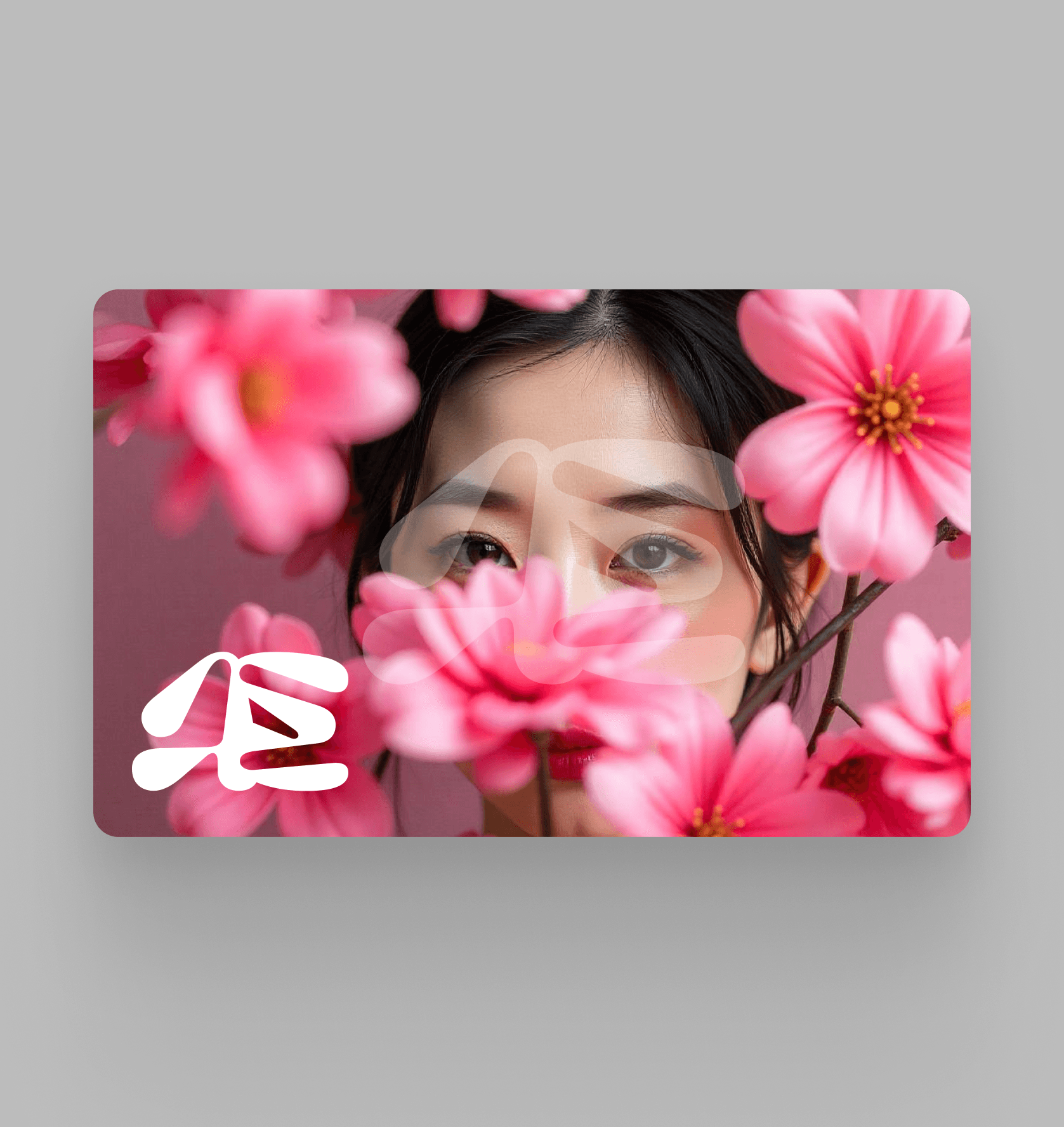
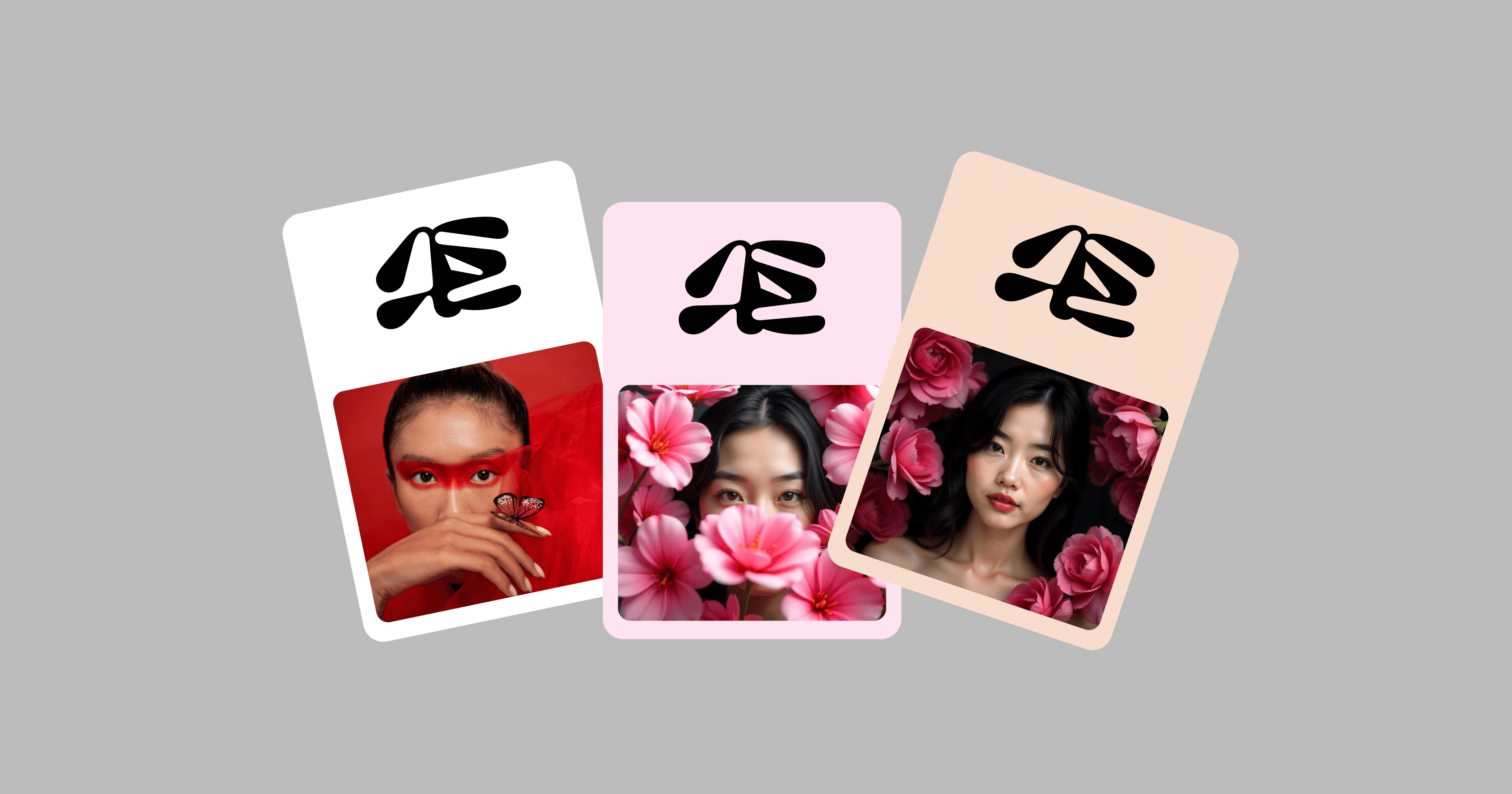
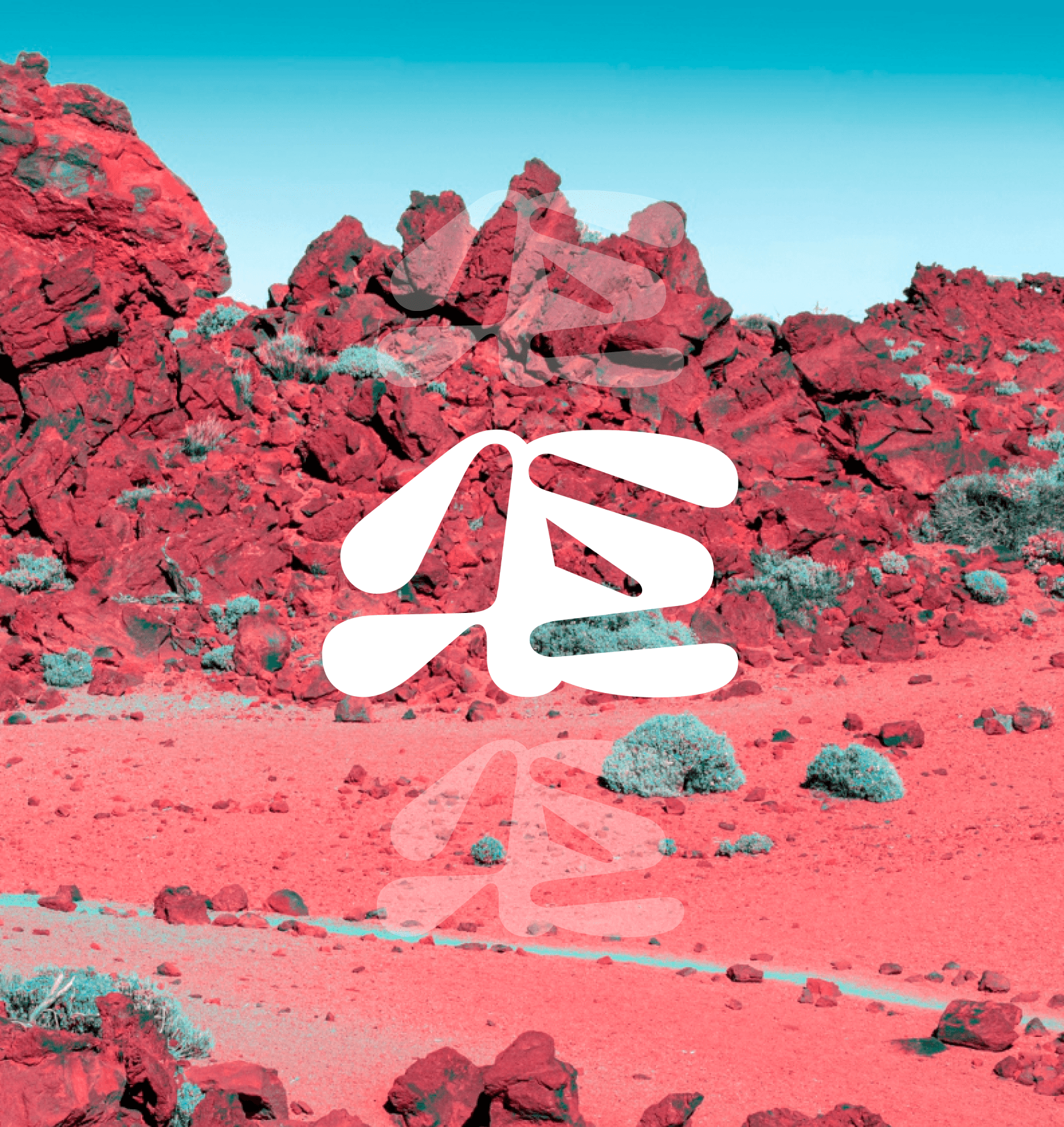
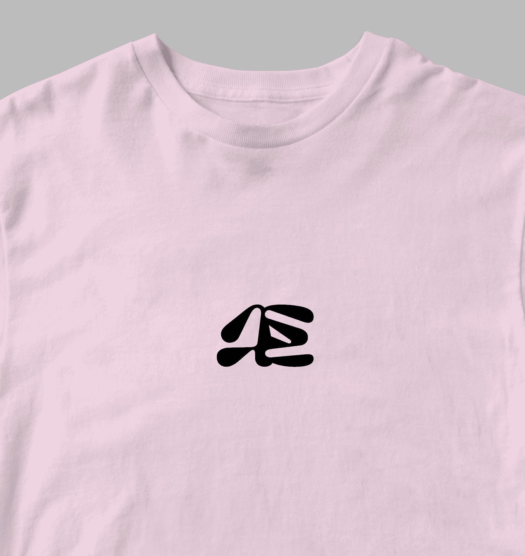
We built the identity around a hand-drawn floral logomark, paired with refined, editorial-style typography. The color palette is inspired by early spring — soft whites, warm neutrals, and petal pinks. The system extends into custom illustrations, packaging mockups, social templates, and business assets.
Every detail — from kerning to icon stroke weight — was fine-tuned to feel thoughtful and harmonious. The result is a brand that feels alive yet minimal, premium but never cold.
Design highlights:
– Hand-drawn logo with natural flow
– Elegant serif + neutral grotesque type system
– Flexible assets for digital & print: icons, textures, color swatches
Impact & Value
An identity that nurtures emotional connection
BlossomField became a core portfolio piece in the wellness/lifestyle niche. It demonstrates our ability to translate abstract values — like peace, care, and renewal — into a tangible, scalable brand system. The project helped us attract similar emotionally-driven clients seeking elevated but grounded aesthetics.
What it brought us:
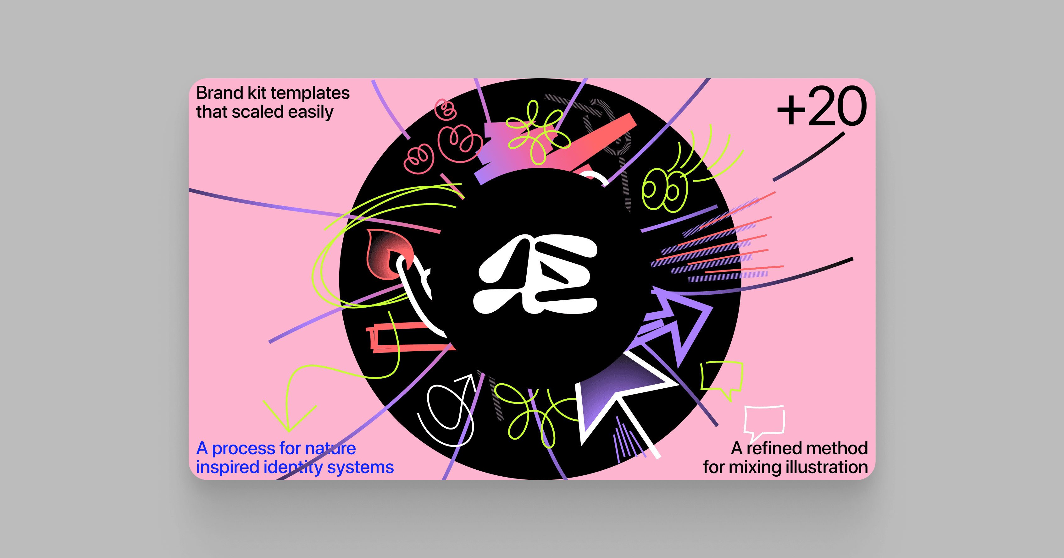
– A process for nature-inspired identity systems
– A refined method for mixing illustration and structure
– Brand kit templates that scaled easily across formats
Brand Discovery
Defining emotion through strategy
We kicked off with a workshop-style exploration of the brand’s values, tone, and ideal audience. Through keywords, moodboards, and brand story sessions, we shaped a foundation of “gentle strength” that guided all design decisions.
Visual Language Creation
From sketches to identity system
We started by sketching floral forms and building a soft but structured wordmark. Typography was chosen to feel both editorial and accessible. Once the logo and core palette were set, we developed supporting elements: icon set, textures, grid system, and brand usage rules.
Application & Brand Kit
Making the brand real across touchpoints
We applied the identity to mockups: packaging, social media, business cards, and a simple brand guide. The final delivery included all assets and usage guidelines, giving the brand team everything needed for a cohesive, flexible presence both online and offline.
